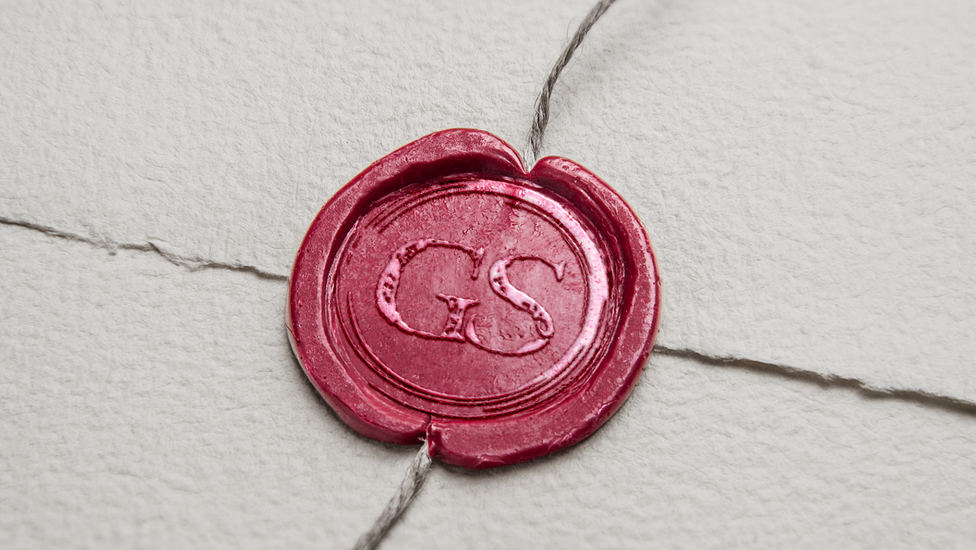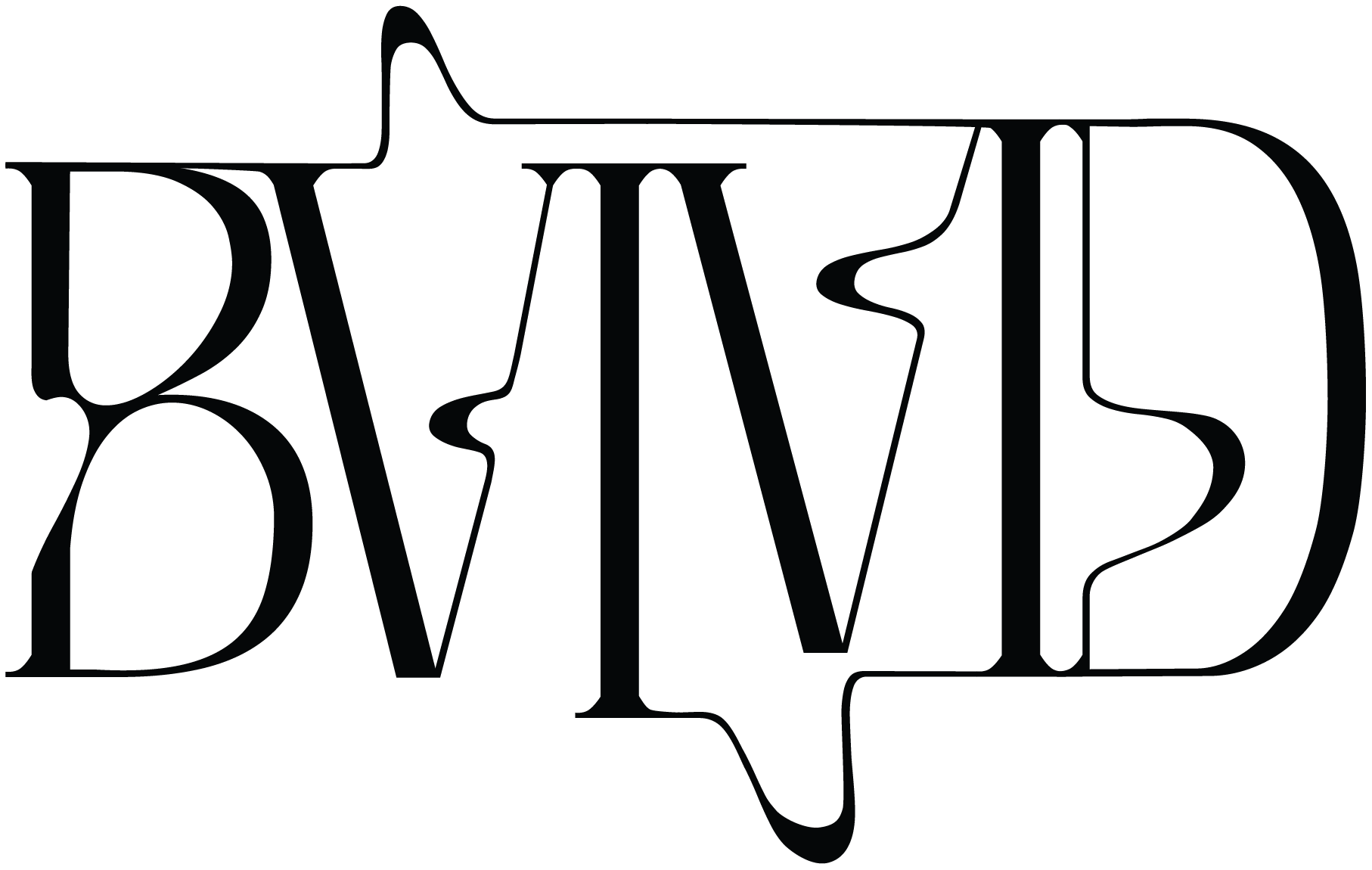

Creating a branding package for my design studio, BVIVID, was an incredibly personal and rewarding project. It was all about capturing the essence of who I am as a designer while presenting a professional and cohesive identity. I wanted the branding to showcase the duality in my design approach—the fun, playful side balanced with a more serious, refined aesthetic. This balance came to life in the logo, where I combined a beautiful serif font with fluid line decals that extend out from the typography. The result is a sophisticated yet dynamic design that perfectly represents my work.
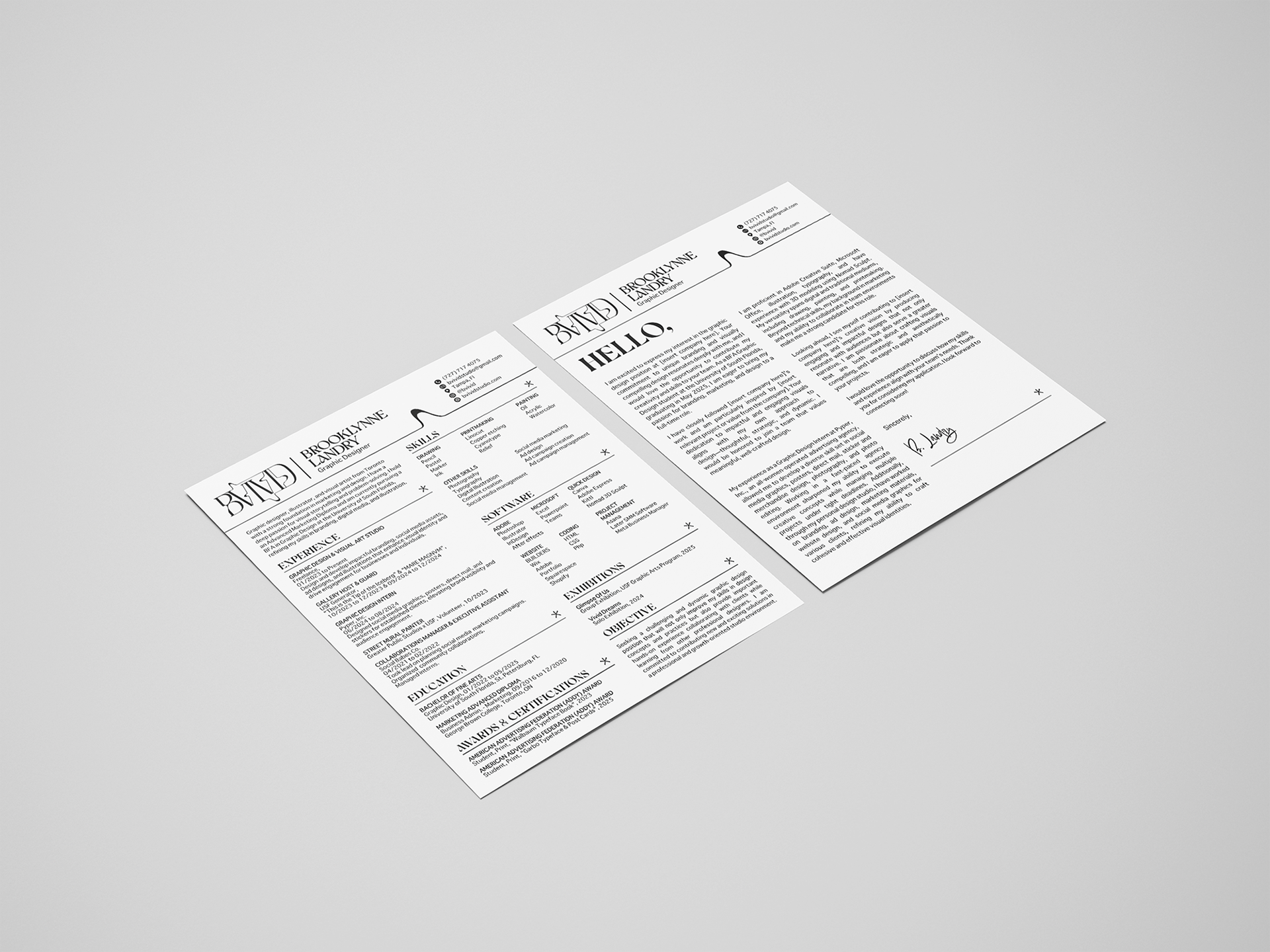
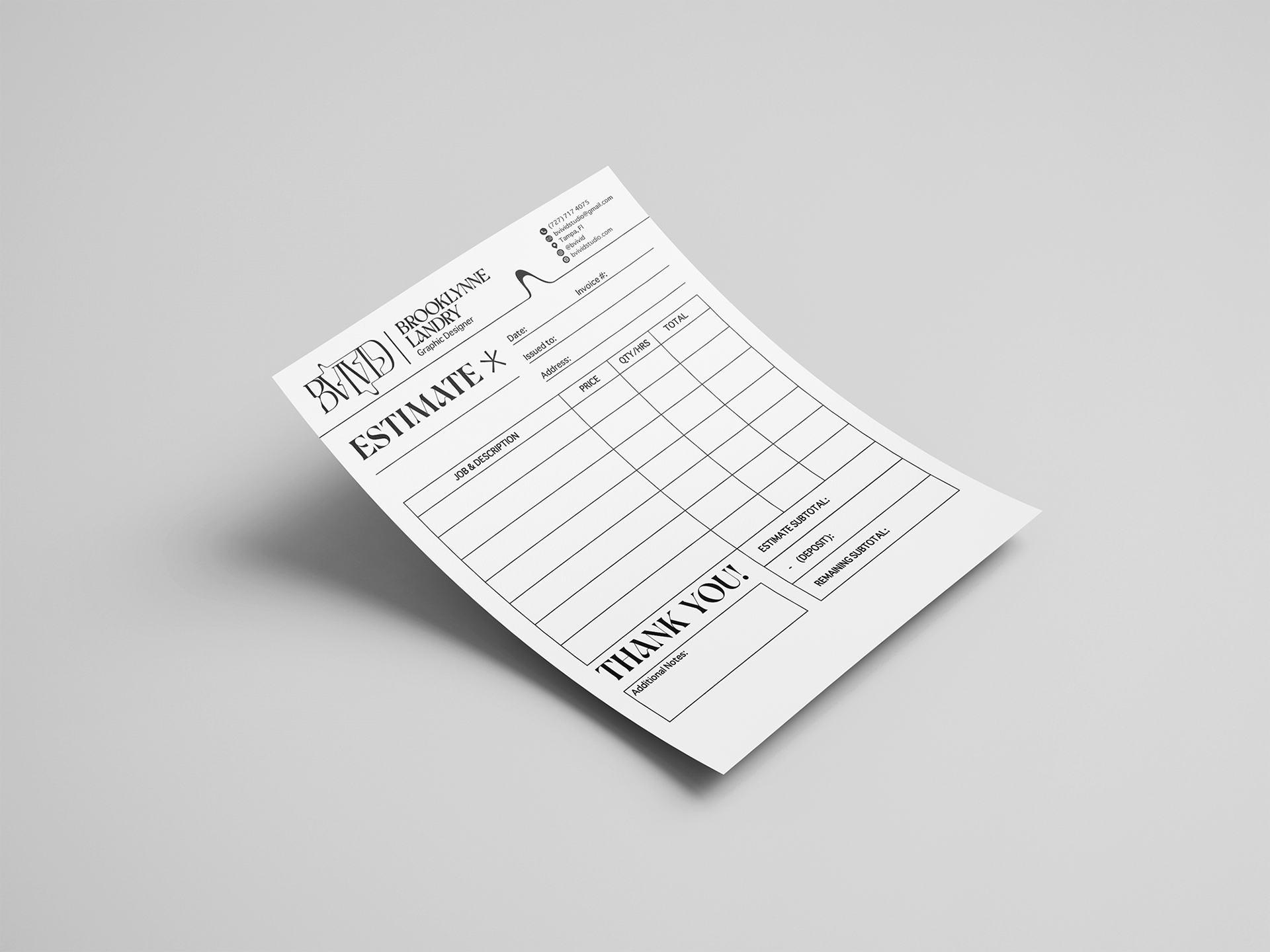
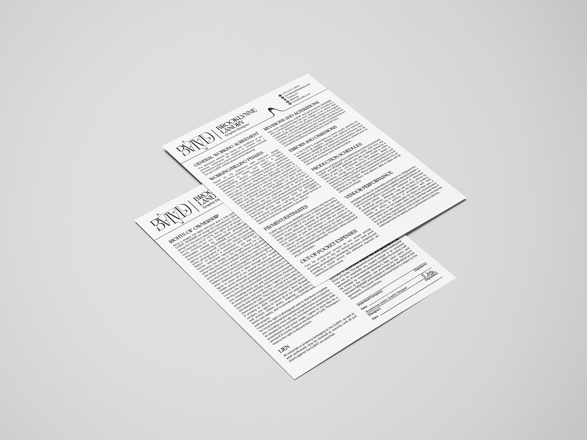
The branding package included every essential piece a design studio would need to operate and stand out. I created a monogram that serves as a recognizable symbol for my studio and carried the branding across materials like a cover letter, resume, contract, price list, and invoice. Each element follows the same branding system, creating a unified look that reflects the professionalism and creativity I bring to my projects. Designing these pieces gave me an appreciation for the small details that can elevate a brand and make it feel cohesive and polished.
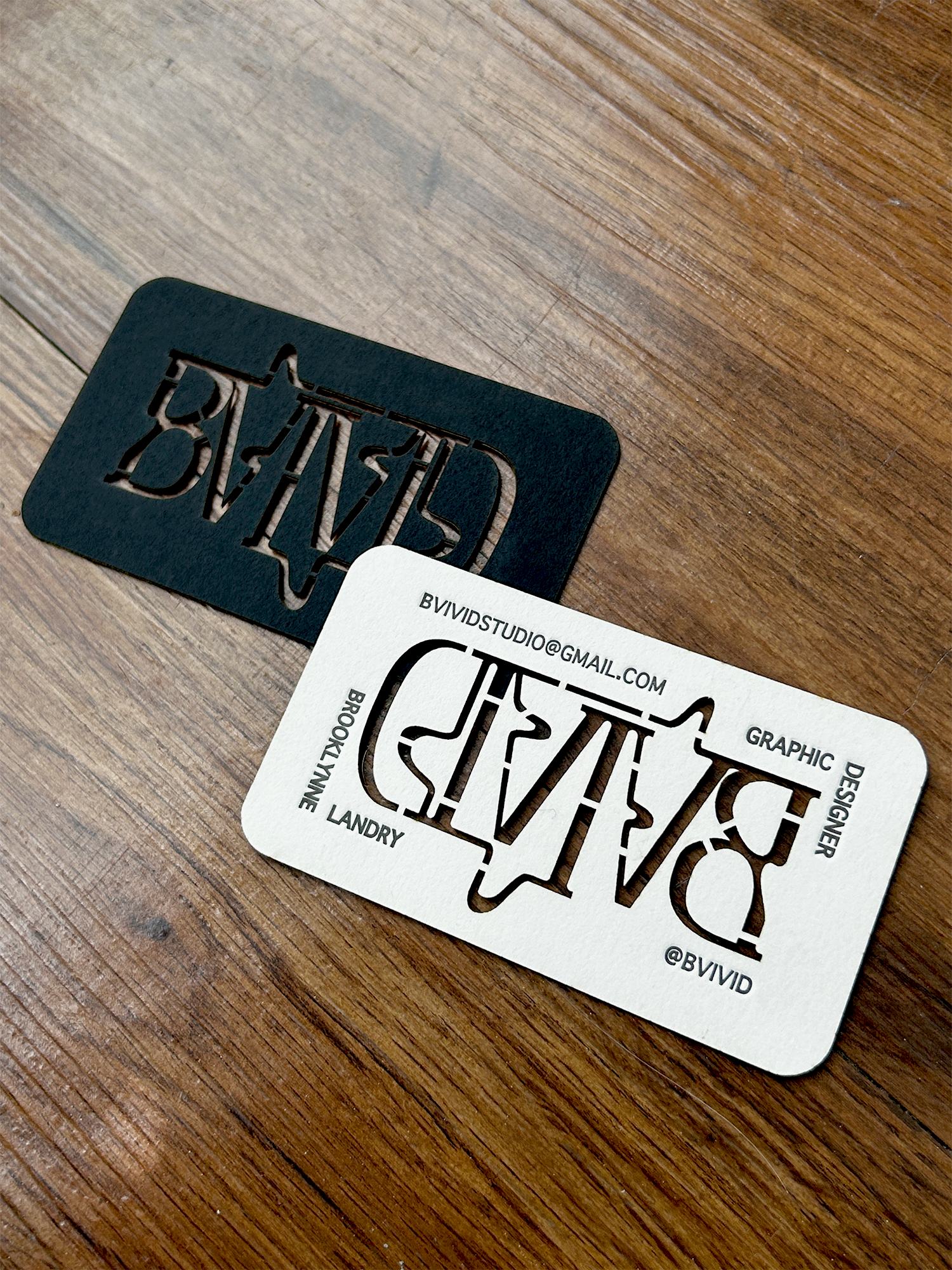
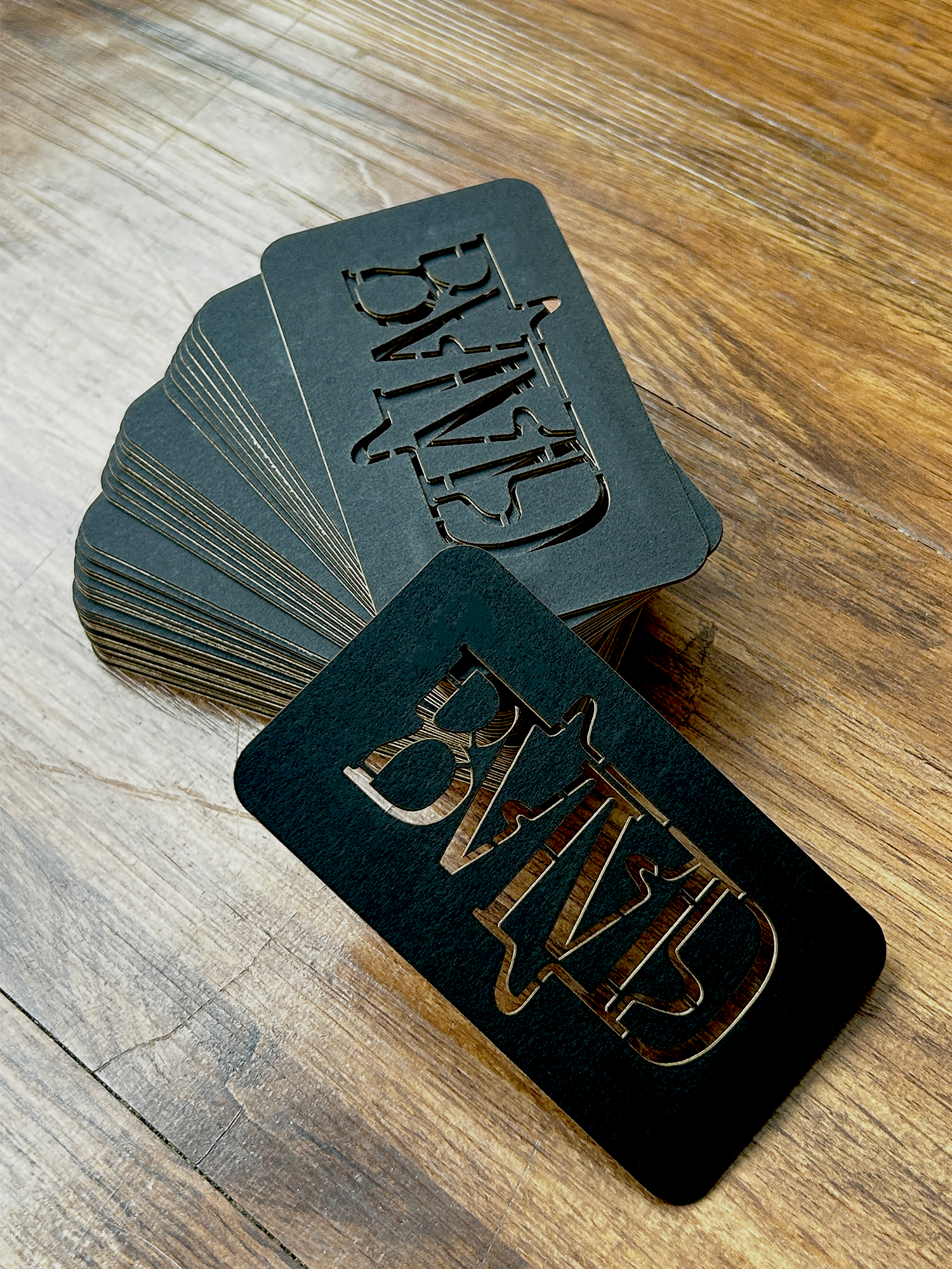
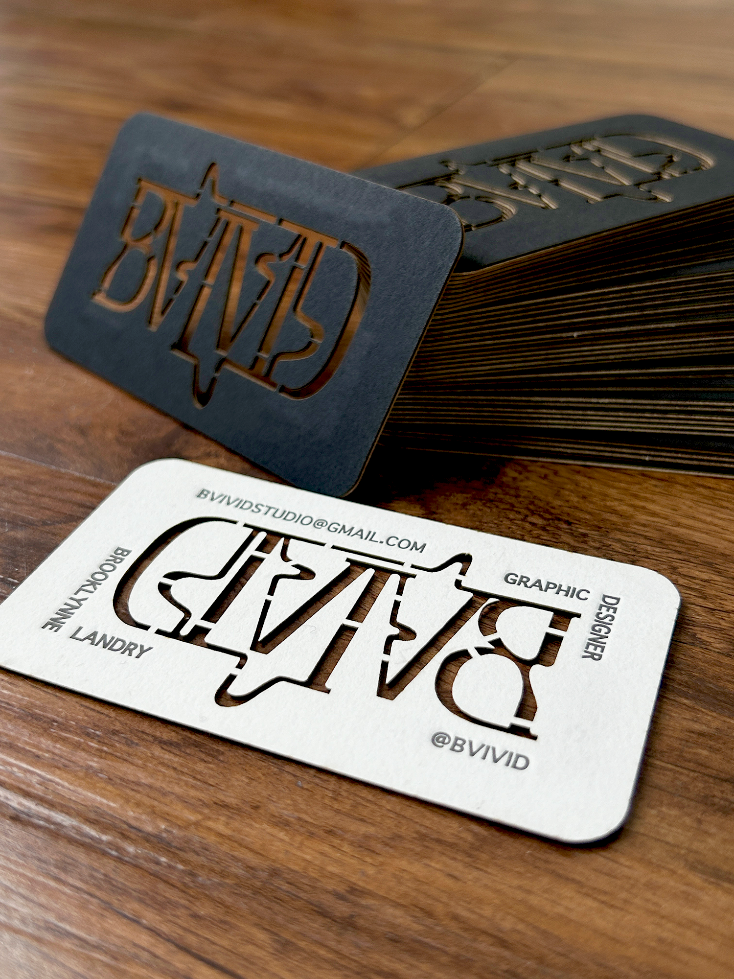
One of the most exciting and personal aspects of the project was creating my business cards, which became a centerpiece of my branding. I wanted these cards to be more than just a way to share my contact information; I wanted them to be a tangible representation of my design philosophy and craftsmanship. To achieve this, I handmade each card, beginning with laser-cutting my logo directly through the center of the material. This decision added a dramatic and elegant element to the design, creating a visually striking and tactile experience that immediately sets the cards apart. The precision of the laser-cutting highlights the fluidity of my logo’s line work, giving the piece a sculptural quality that invites people to touch and examine it closely.
To complement the laser-cut logo, I incorporated letterpress printing to add my contact details. This traditional printing method not only brought a tactile depth to the cards but also balanced the modern laser-cutting with a sense of timeless craftsmanship. The combination of these techniques created an intriguing contrast—modern and innovative yet grounded in tradition, which reflects my dual approach to design. The careful selection of materials, along with the meticulous execution of these processes, gave the cards a luxurious feel that aligned perfectly with the overall branding of BVIVID.
By investing so much time and effort into these cards, I ensured that they weren’t just functional but memorable, leaving a lasting impression on anyone who received them. Each card felt like a miniature piece of art, a testament to the thoughtfulness and creativity I bring to my work. This process taught me the value of going the extra mile and how meaningful design can come alive through a hands-on, experimental approach. The experience not only elevated my branding but also gave me a newfound appreciation for the intersection of design and craftsmanship.
Overall, working on BVIVID was an extensive and introspective journey. It allowed me to explore and define myself as a designer, not just through aesthetics but also in how I envision the kind of work I want to create and share with the world. This project gave me a deeper understanding of my own style and voice, and it’s exciting to see that come to life in a complete, professional package. It’s a brand I’m proud to call my own, and it sets the foundation for all the creative ventures I’ll take on moving forward.