Editorial Design | Typography System | AAF ADDY Award Winner (2023)

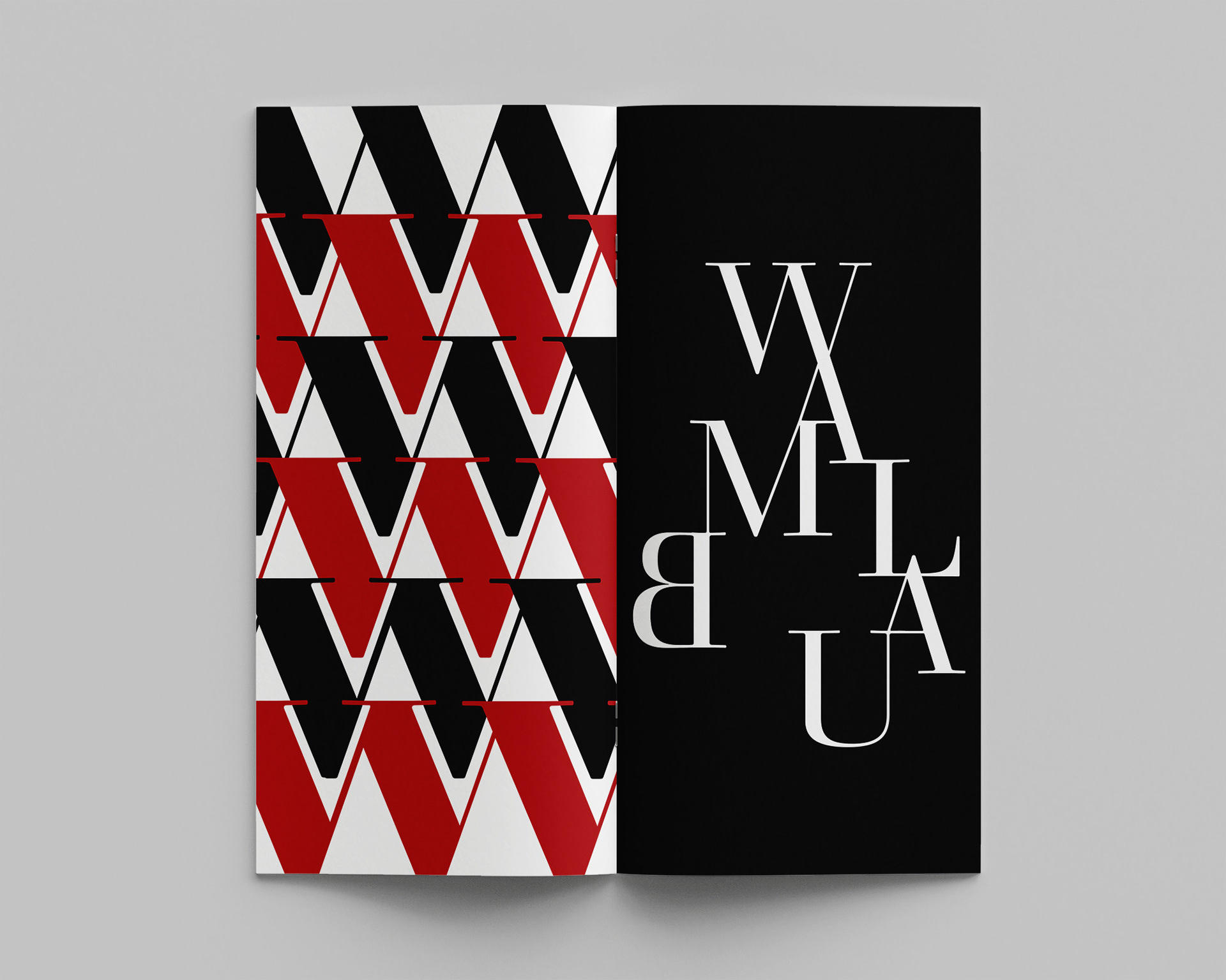
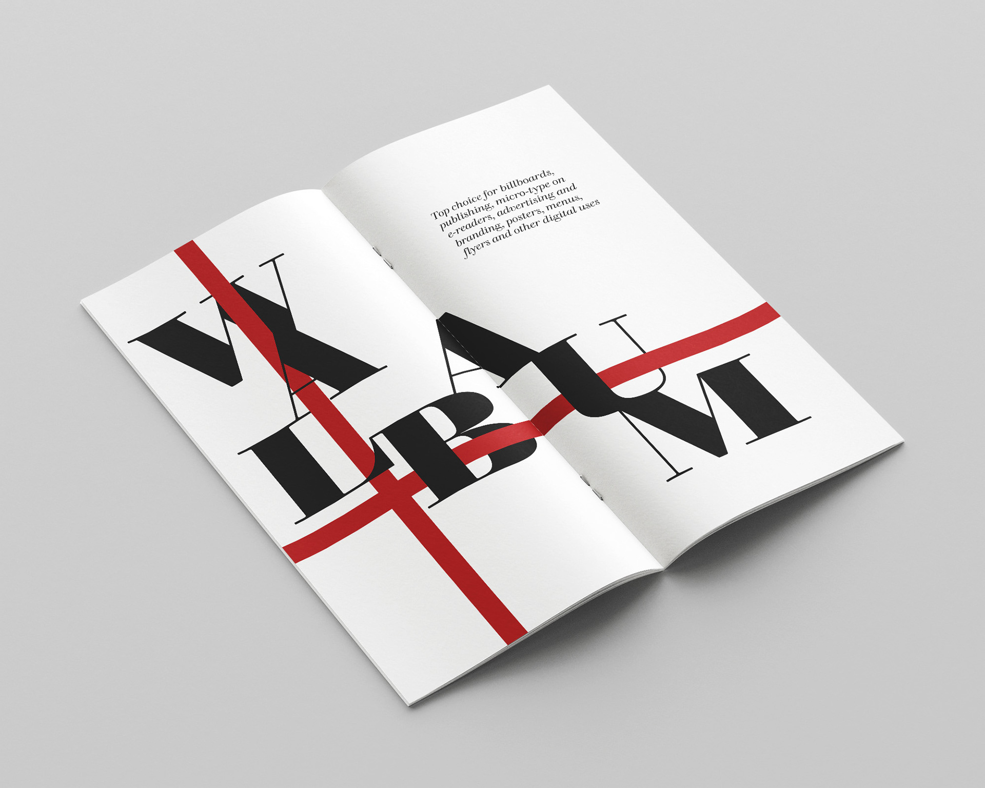
This project is an editorial exploration of the Walbaum typeface, designed to showcase its elegance, versatility, and modern application through a cohesive print system. The book highlights the balance between classic serif structure and contemporary typographic expression, using layout, hierarchy, and contrast to bring the typeface to life.
STRATEGY / DESIGN APPROACH
The goal was to create a visually compelling and structured typographic system that demonstrated both readability and expressive design. I focused on strong typographic hierarchy, grid-based layouts, and intentional use of negative space to guide the viewer through each spread.
High-contrast compositions, bold scale shifts, and minimal color accents were used to emphasize key letterforms while maintaining a refined and modern aesthetic. Each spread was designed to explore different typographic behaviors—from editorial readability to expressive display—while remaining cohesive as a complete system.
TOOLS + EXECUTION
The project was designed using Adobe InDesign for layout and editorial structure, with Adobe Illustrator used to refine typographic compositions and custom letterform treatments. This workflow allowed for precise control over typography, alignment, and visual consistency across all spreads.

RESULTS / RECOGNITION
This project was recognized with an AAF ADDY Award (American Advertising Federation) in the Student Print category for the Walbaum Typeface Book (2023), highlighting its strength in typography, layout execution, and overall design system.