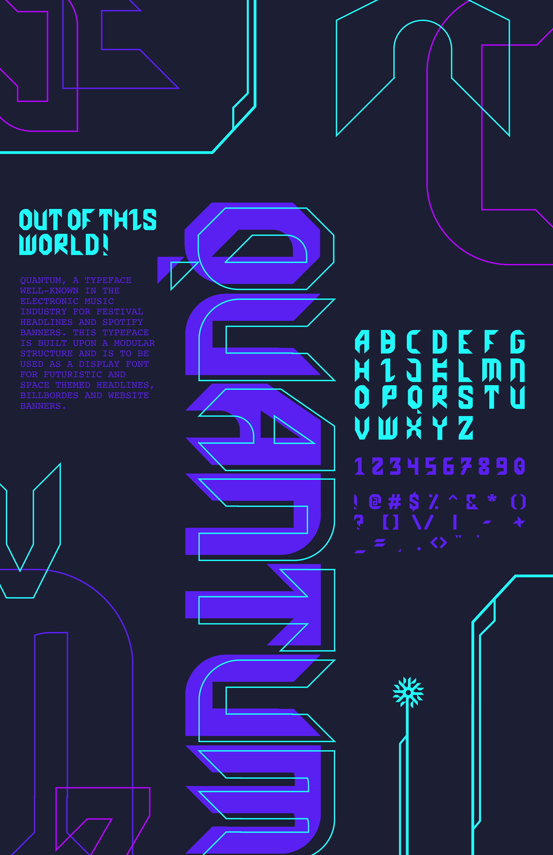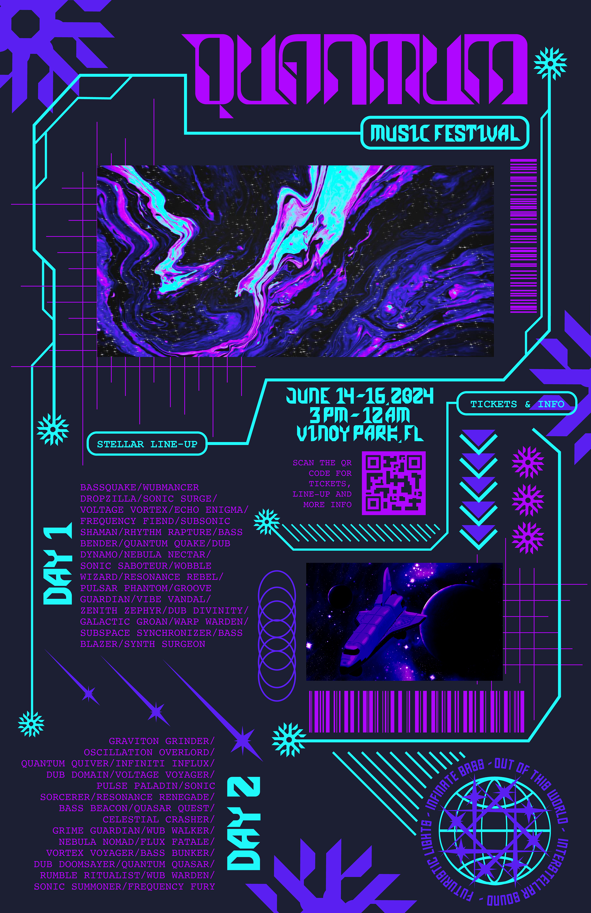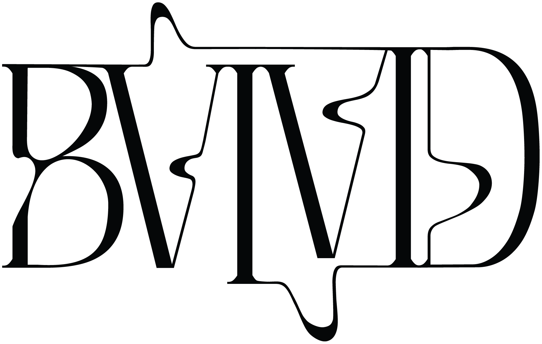

Quantum is a project close to my heart, inspired by my deep love for music festivals and the electrifying energy they bring. For this project, I designed the typography entirely by hand, letting my creativity flow from start to finish. The sci-fi inspiration shines through in every detail, with sharp angles and futuristic vibes giving it a bold, edgy look. The vibrant color palette was a must—it captures the excitement and intensity of a festival experience perfectly, and I love how the colors practically pulse with energy.

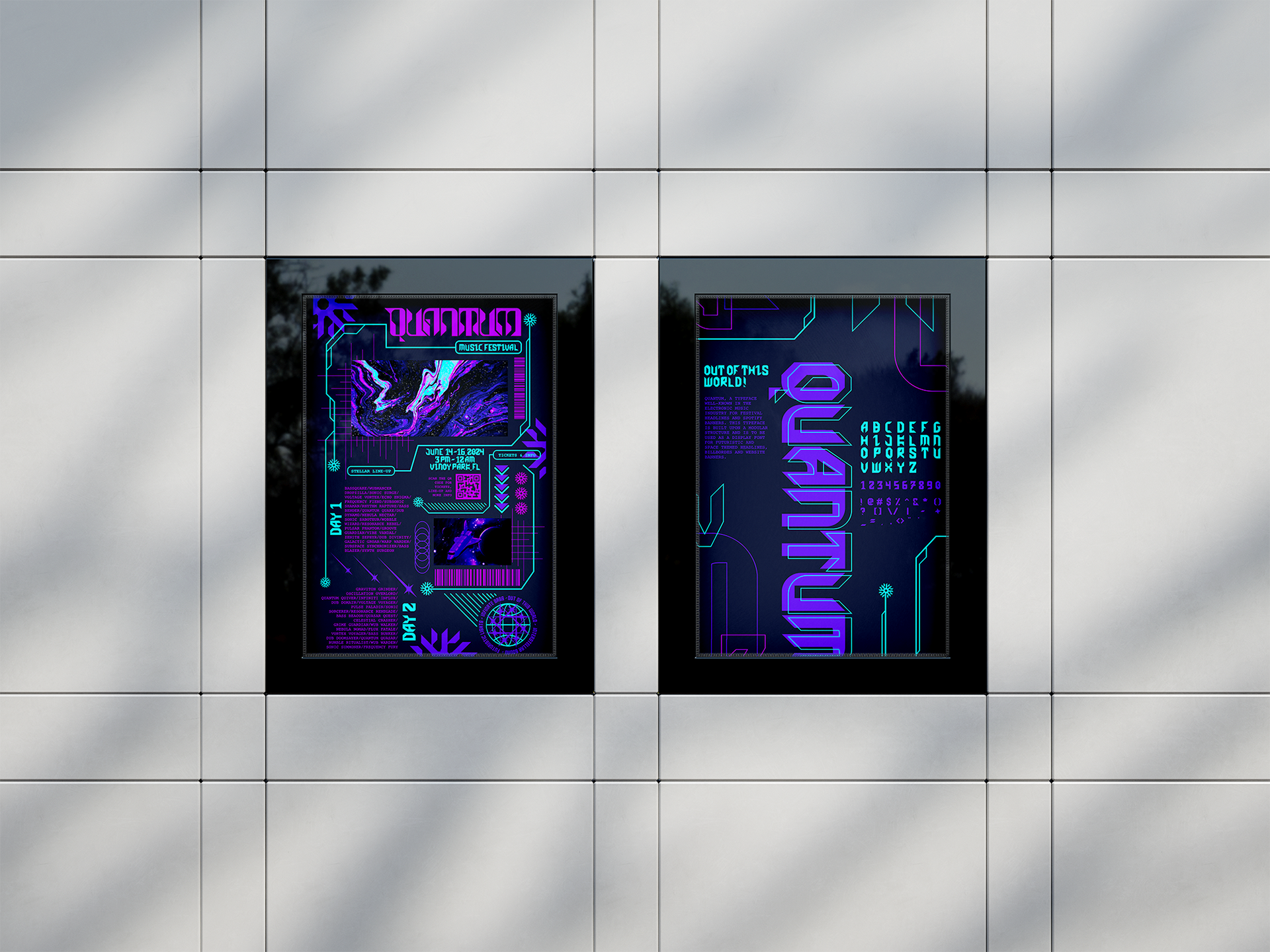
As part of the project, I created a custom typeface poster, a promotional festival poster, wristbands, tickets, and a lettering swatch. Each piece felt like a chance to explore how the typography could live in different spaces, from physical tickets you’d keep as a memento to bold posters that command attention. Every element ties back to the spirit of music festivals, where design and energy collide to create something unforgettable. I loved thinking about how these designs would feel in a real-world setting, where they could help build excitement and anticipation for festival-goers.

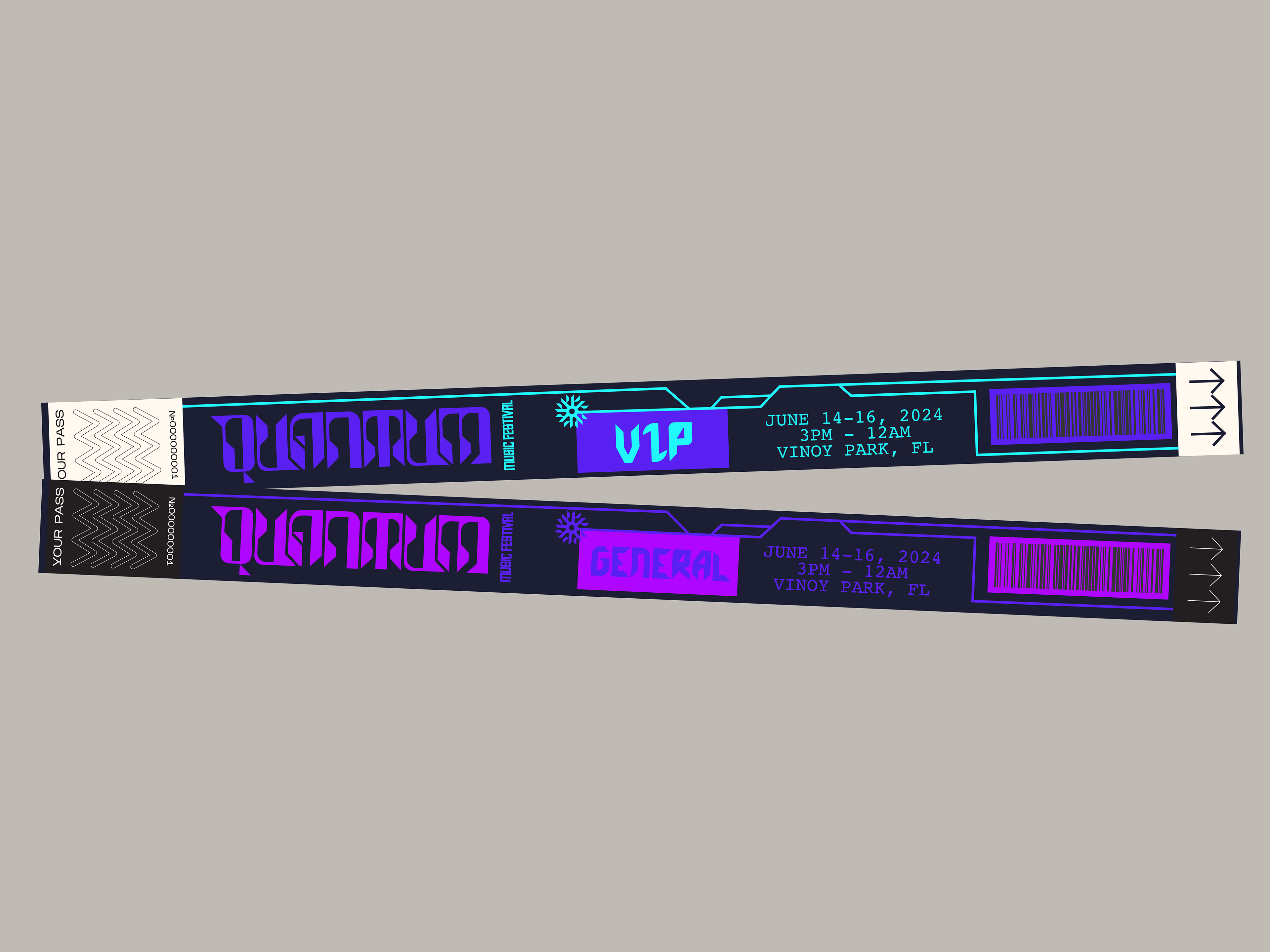
What I enjoyed most about this project was working with vibrant, bold, and exciting colors—it’s a style that truly resonates with me. It’s always so satisfying to take an idea and push it to its limits with color, texture, and detail. Quantum challenged me to stay playful and experimental while still making everything cohesive, and I couldn’t be happier with how it all came together.