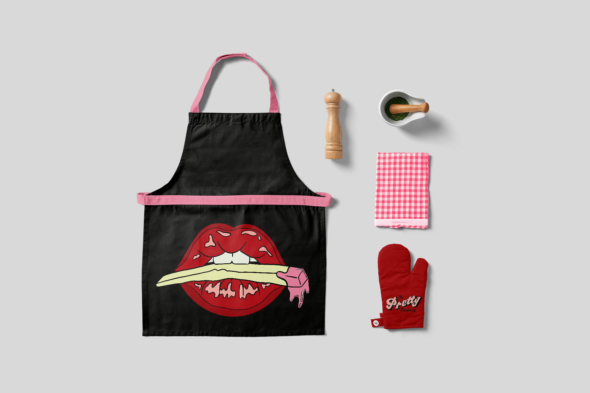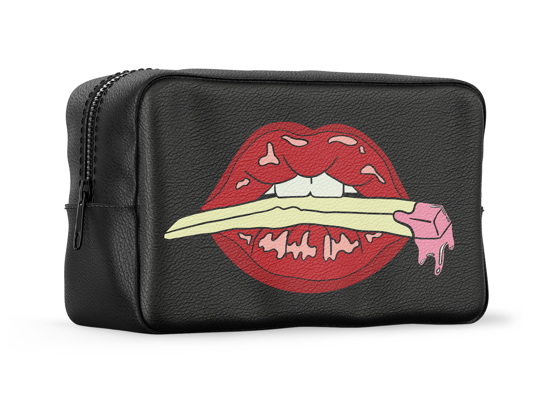

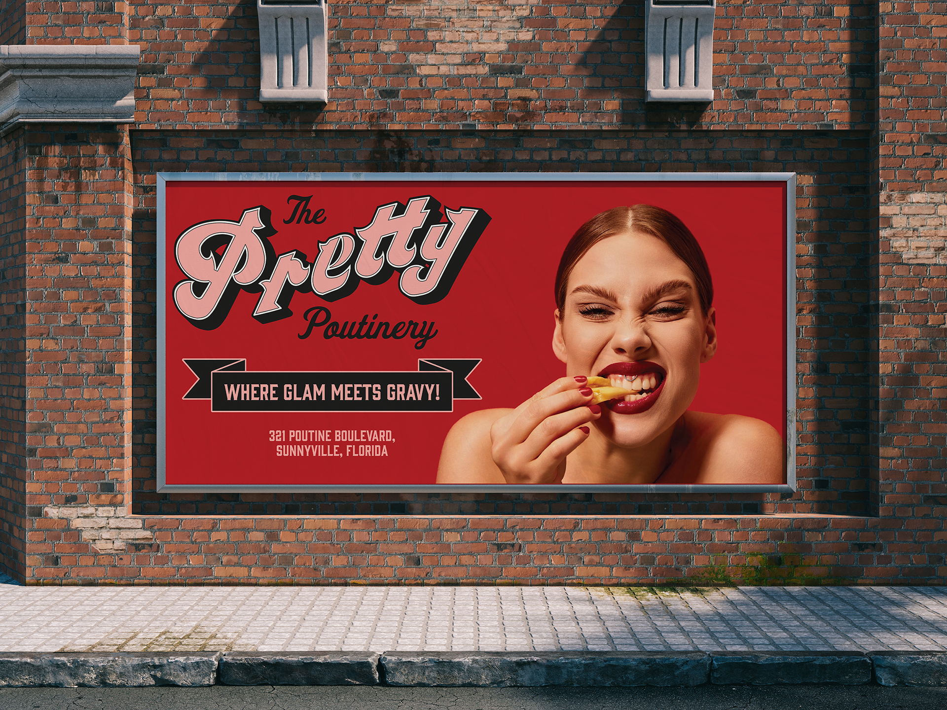
The Pretty Potinery was such a fun and unique branding project that allowed me to explore the playful intersection of two unexpected concepts: makeup and food, specifically poutine. At the heart of the brand, I hand-lettered the main typeface to bring a personal, custom feel to the identity. Combining these two worlds was an exciting challenge, and it gave the brand a quirky, unforgettable personality that feels both fresh and cheeky.
For this project, I created a typeface swatch to set the tone and designed various mockups, including a menu and a mobile website interface. Each element was thoughtfully crafted to reflect the brand's fun and sassy vibe. The final touch was a brand guideline book, which pulled everything together cohesively and ensured that The Pretty Potinery’s bold identity could shine across every platform. Seeing the pieces come together made the concept feel tangible and real, and it was so satisfying to see the vision fully realized.

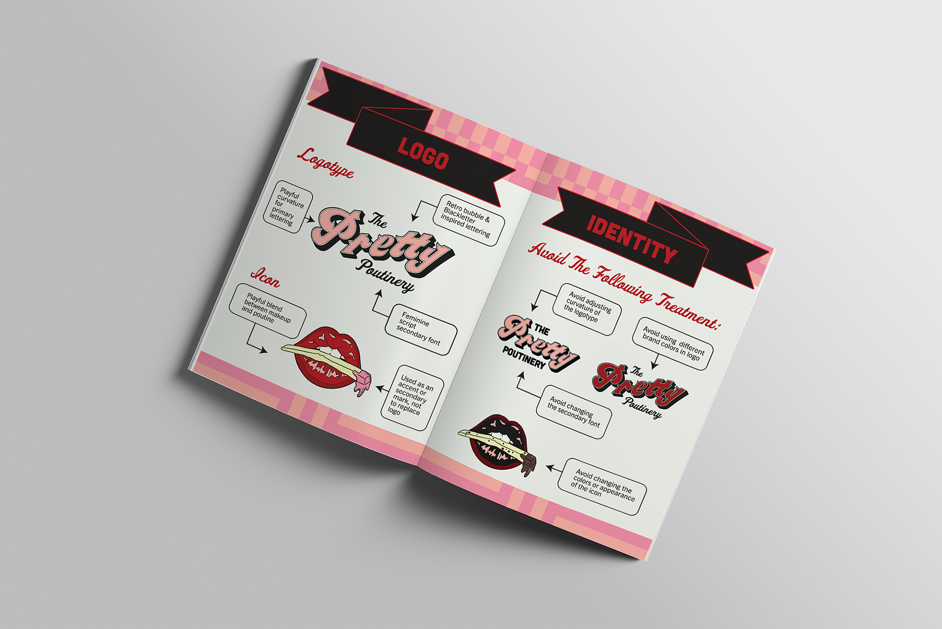
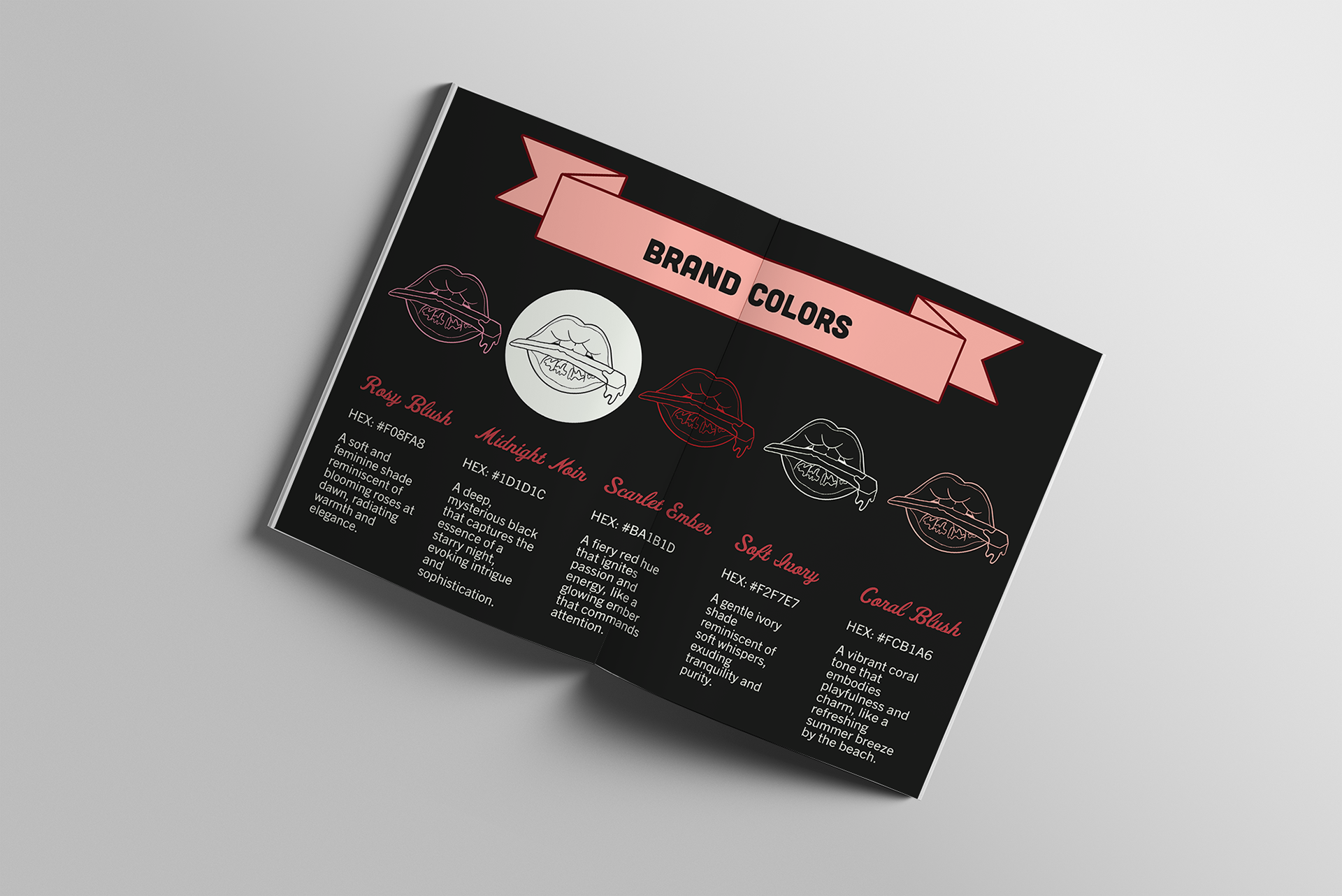
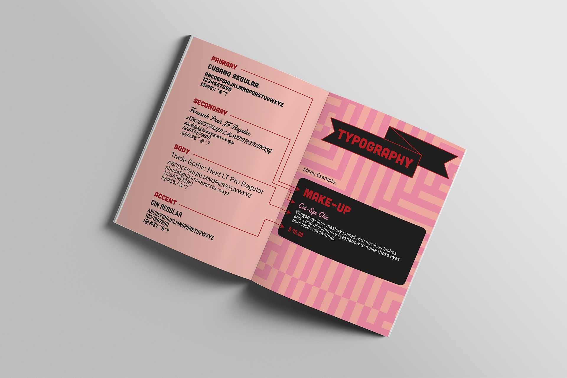


The overall vibe of this brand was inspired by a mix of sassy pin-up aesthetics and retro diner charm. I leaned into colorful and bubbly typography and patterns that contrasted beautifully with bold, striking makeup elements. This blend of playful and daring gave the brand its signature personality—full of attitude, style, and a dash of nostalgia. It was such a joy to design something that felt so fresh, bold, and distinctly me!