• Selected Works
  • Joe & Son's Olive Oil
  • Joe & Son's Olive Oil Email Campaign
  • Greenbug Inc.
  • Aurora Modern Homes
  • Walbaum
  • La Segunda
  • Digital Ad Design
  • Greenbug Inc.
  • Joe & Son's Olive Oil
  • Champion Marine
  • Aurora Medical
  • ARICA Roofing & Construction
  • Shawn & Shawn Moving
  • Social Media Design
  • La Segunda
  • Bravo Store Systems
  • Adobe Live
  • Pyper, Inc.
  • Socials & Stilettos
  • Animation & Motion Design
  • La Segunda Reels
  • Petavana Logo Animation
  • Typographic Animation
  • Squirrelaggedon Trailer
  • Brand Design
  • Aurora Modern Homes
  • 4 The Girls Coffee Co.
  • BVIVID identity package
  • City Country Coast
  • Mama Meatless
  • Eco Spoon
  • Email Design
  • Joe & Son's Olive Oil Email Campaign
  • Typography
  • Walbaum
  • GARBO Typeface & Post Cards
  • QUANTUM
  • Yale Typographic Poster
  • Other Design
  • Hotel Tampa Fact Sheet
  • Reflections Book
  • Guia Scents
  • About Me
  • My Bio
Contact Me
Brooklynne Landry
  • Selected Works
  • Joe & Son's Olive Oil
  • Joe & Son's Olive Oil Email Campaign
  • Greenbug Inc.
  • Aurora Modern Homes
  • Walbaum
  • La Segunda
  • Digital Ad Design
  • Greenbug Inc.
  • Joe & Son's Olive Oil
  • Champion Marine
  • Aurora Medical
  • ARICA Roofing & Construction
  • Shawn & Shawn Moving
  • Social Media Design
  • La Segunda
  • Bravo Store Systems
  • Adobe Live
  • Pyper, Inc.
  • Socials & Stilettos
  • Animation & Motion Design
  • La Segunda Reels
  • Petavana Logo Animation
  • Typographic Animation
  • Squirrelaggedon Trailer
  • Brand Design
  • Aurora Modern Homes
  • 4 The Girls Coffee Co.
  • BVIVID identity package
  • City Country Coast
  • Mama Meatless
  • Eco Spoon
  • Email Design
  • Joe & Son's Olive Oil Email Campaign
  • Typography
  • Walbaum
  • GARBO Typeface & Post Cards
  • QUANTUM
  • Yale Typographic Poster
  • Other Design
  • Hotel Tampa Fact Sheet
  • Reflections Book
  • Guia Scents
  • About Me
  • My Bio
Contact Me

Yale Typographic Poster


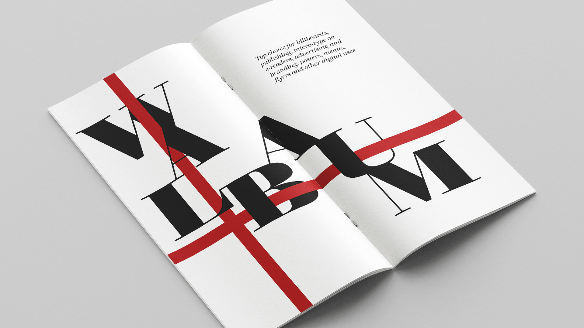
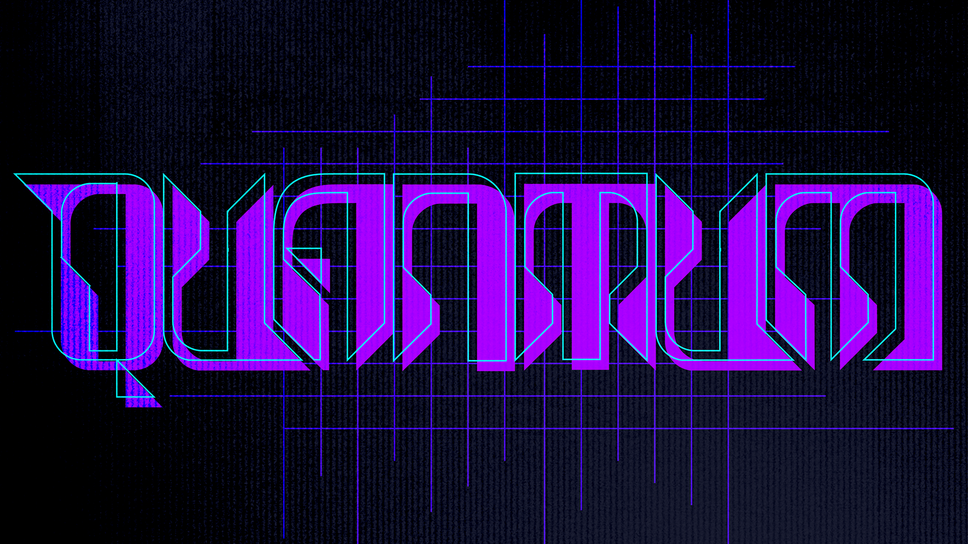
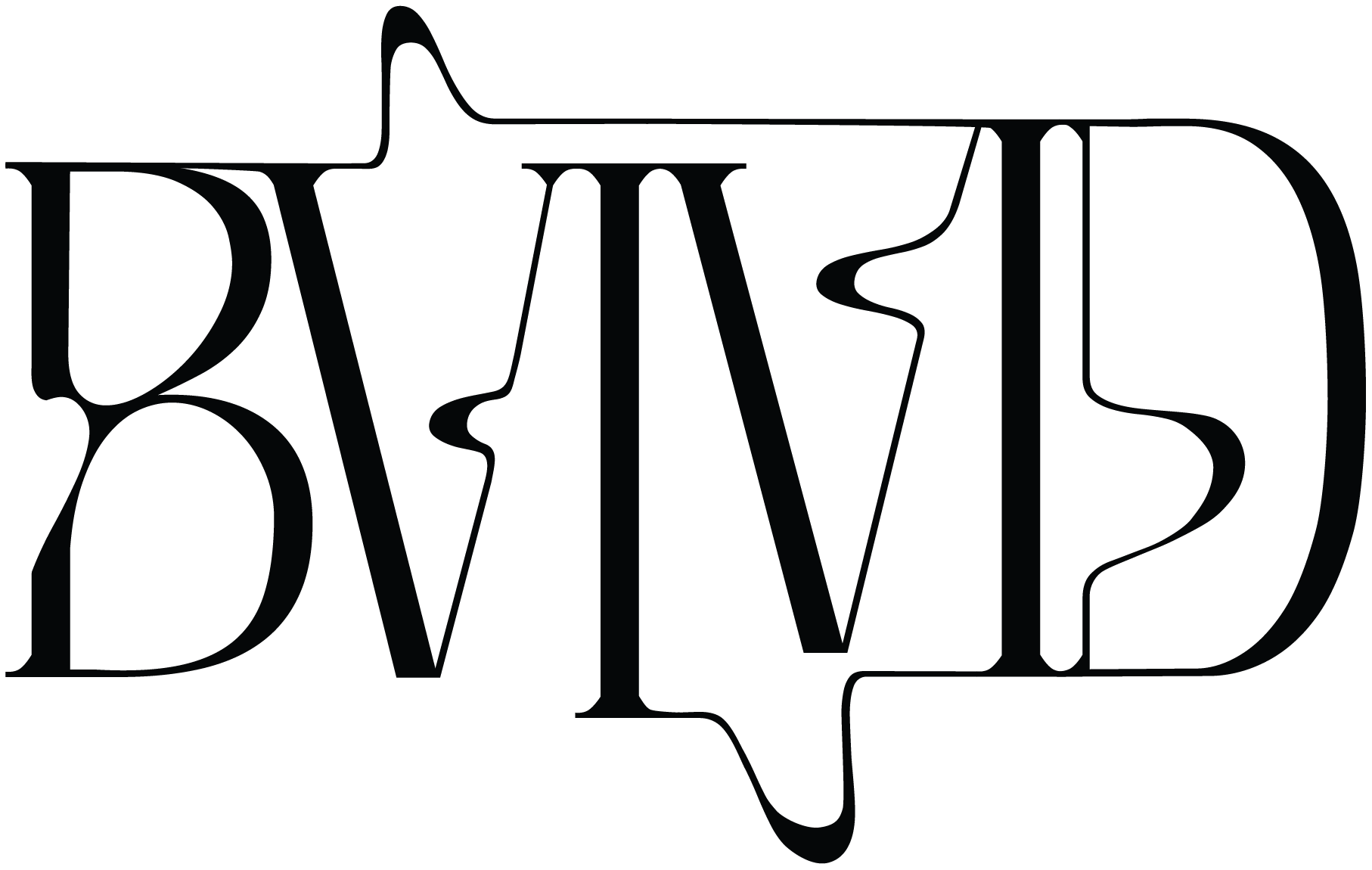
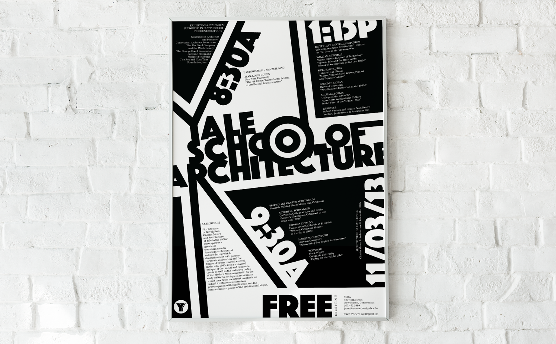
With this typographic poster, my aim was to capture attention through a captivating interplay of bold text, dynamic forms, and an innovative grid structure. In a world saturated with mundane text, where it's all too easy to drown in the sea of information, I envisioned typography as more than words on paper. It became a dynamic tool, crafting visually appealing forms that draw the viewer in, ensuring they can't help but stop and take notice as they pass by this poster.

You may also like

2025
GARBO Typeface & Post Cards
2022
Walbaum
2024
QUANTUM
↑Back to Top
Powered by Adobe Portfolio