Project Overview
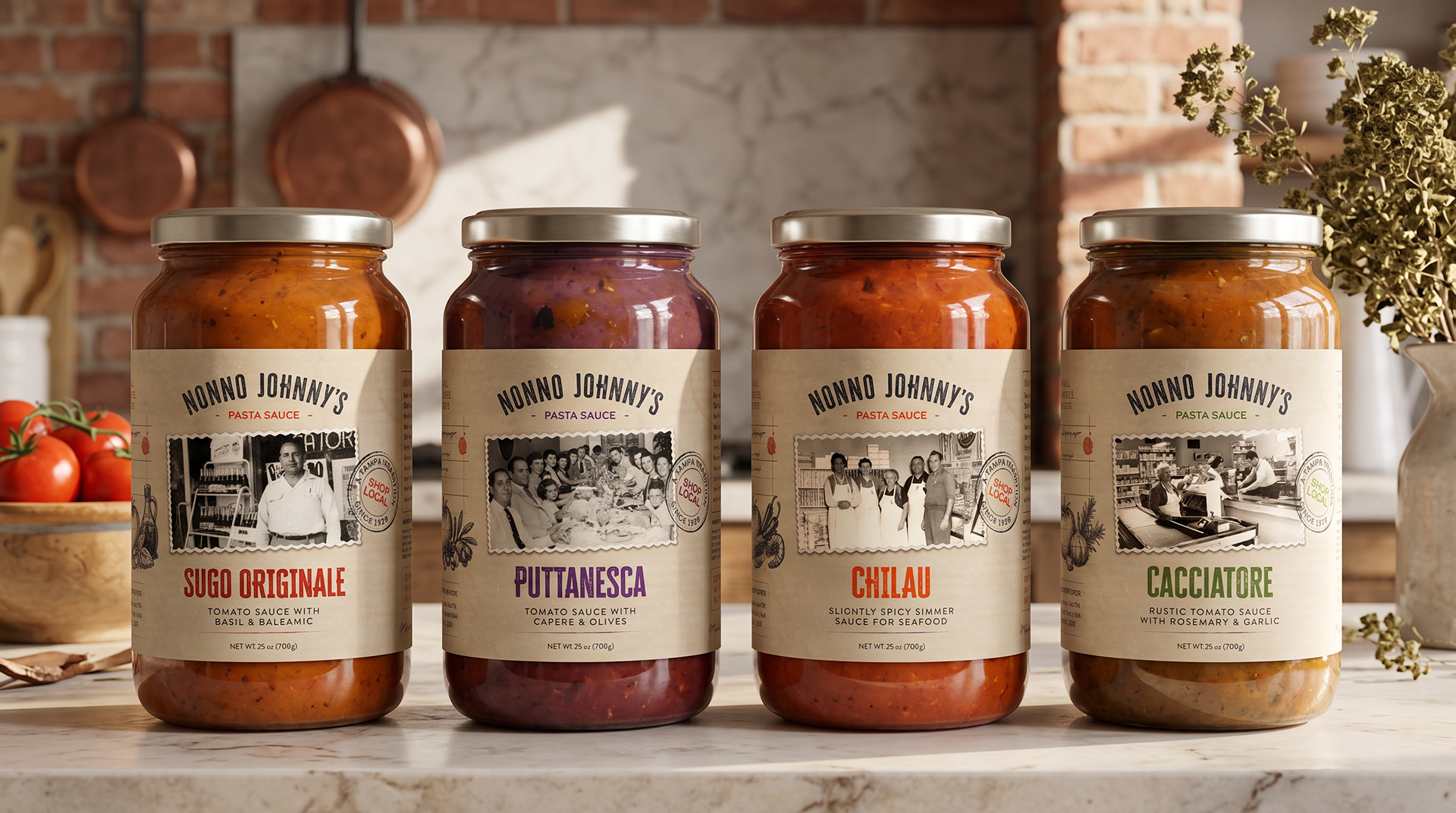
Nonno Johnny's is a line of Italian-inspired pasta sauces rooted in family recipes and the heritage of Joe & Son's Olive Oils. The goal was to develop a packaging system that felt authentic to the brand's history while creating a distinctive, cohesive presence across four sauce varieties.
The Goal
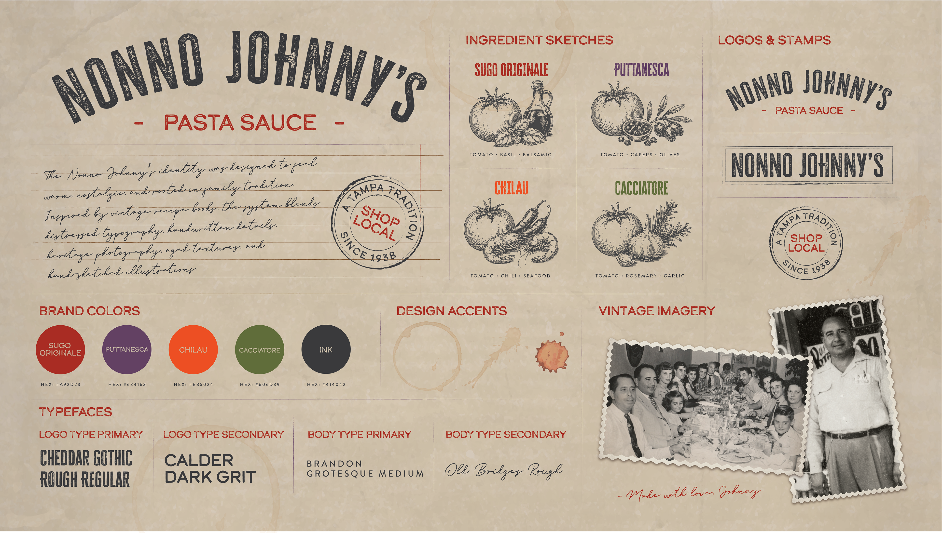
The goal was to create packaging that felt personal and heritage-driven rather than relying on generic Italian food branding. The system needed to communicate Nonno Johnny's family story while clearly differentiating each recipe on shelf.
Creative Strategy
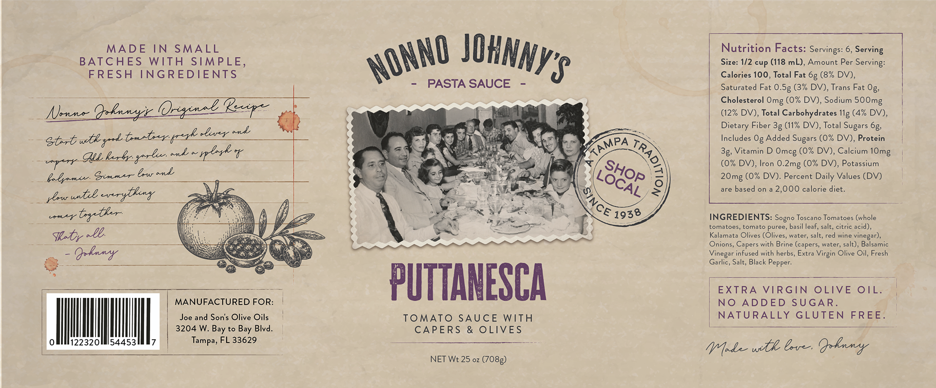
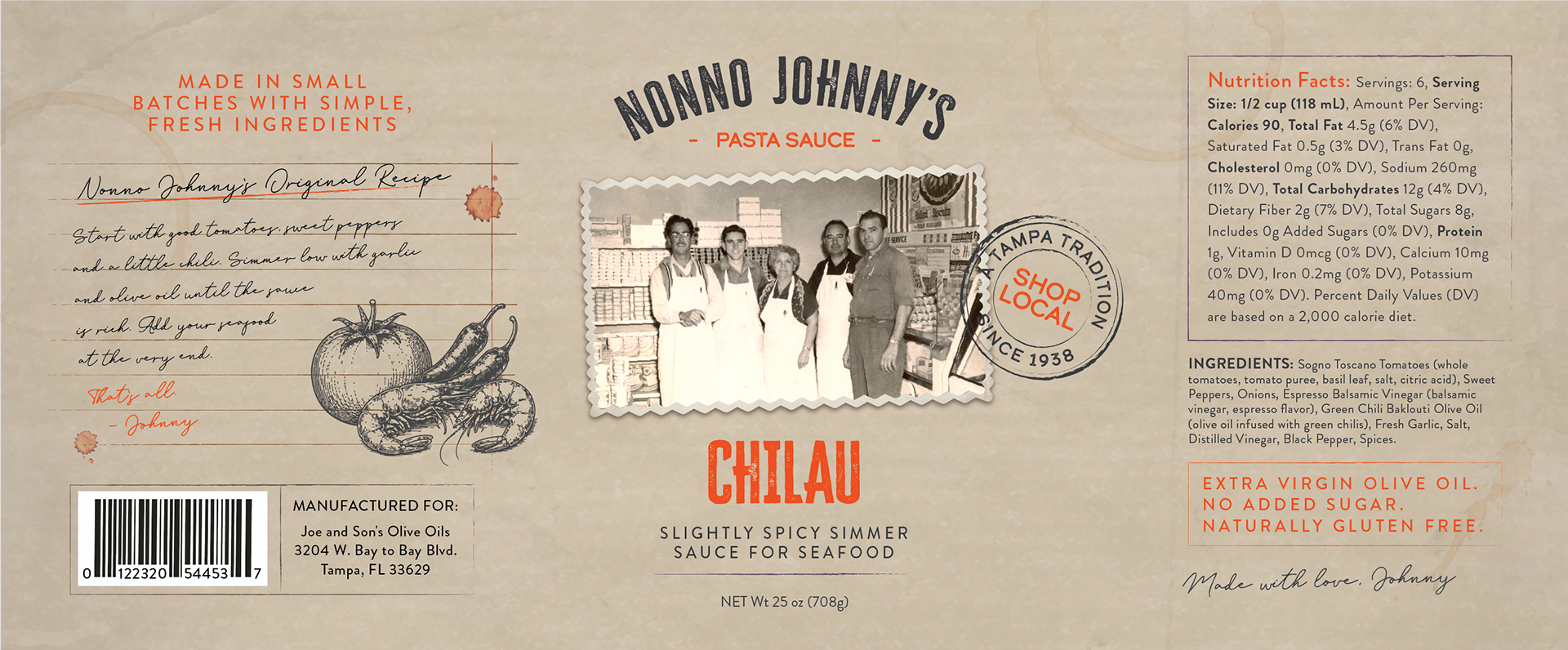
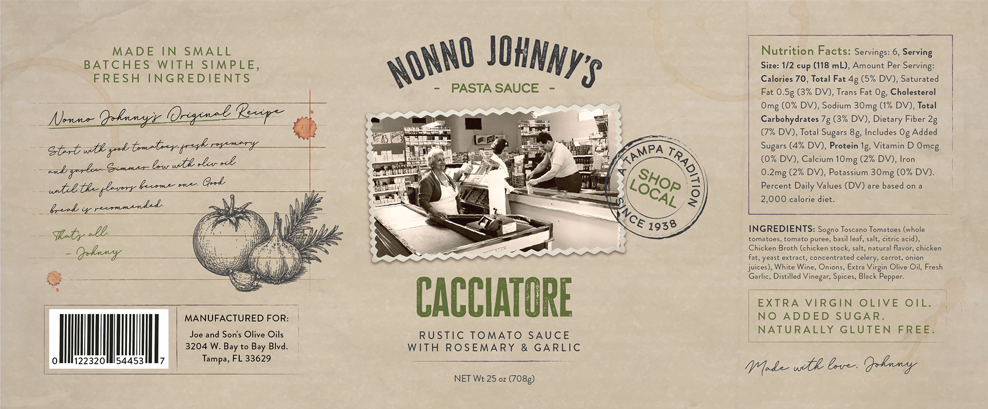
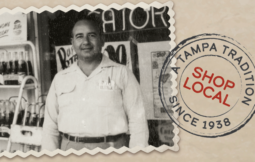
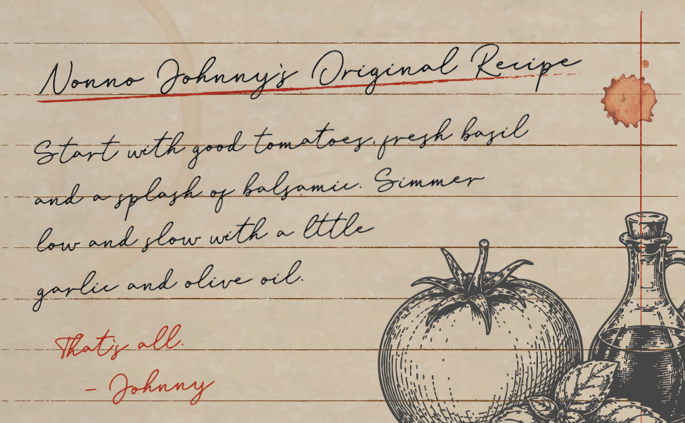
The final direction was inspired by a vintage family recipe book. Handwritten notes, aged paper textures, archival photography and illustrated ingredients were combined to make each label feel like a piece of Nonno Johnny's history.
Design Approach
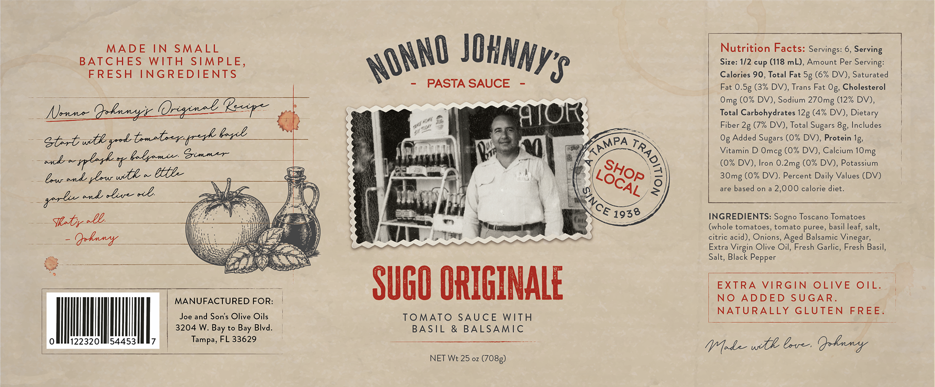
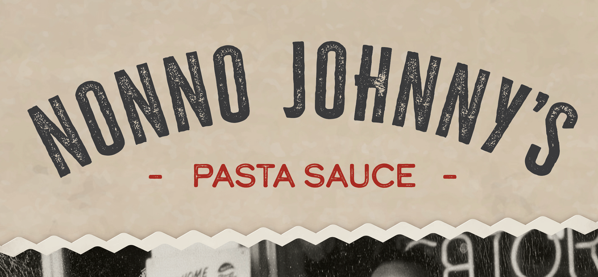
The wraparound label was designed to tell a story from every angle. The front establishes a strong shelf presence, while the surrounding panels incorporate recipe details, family photography, ingredient illustrations and required product information.
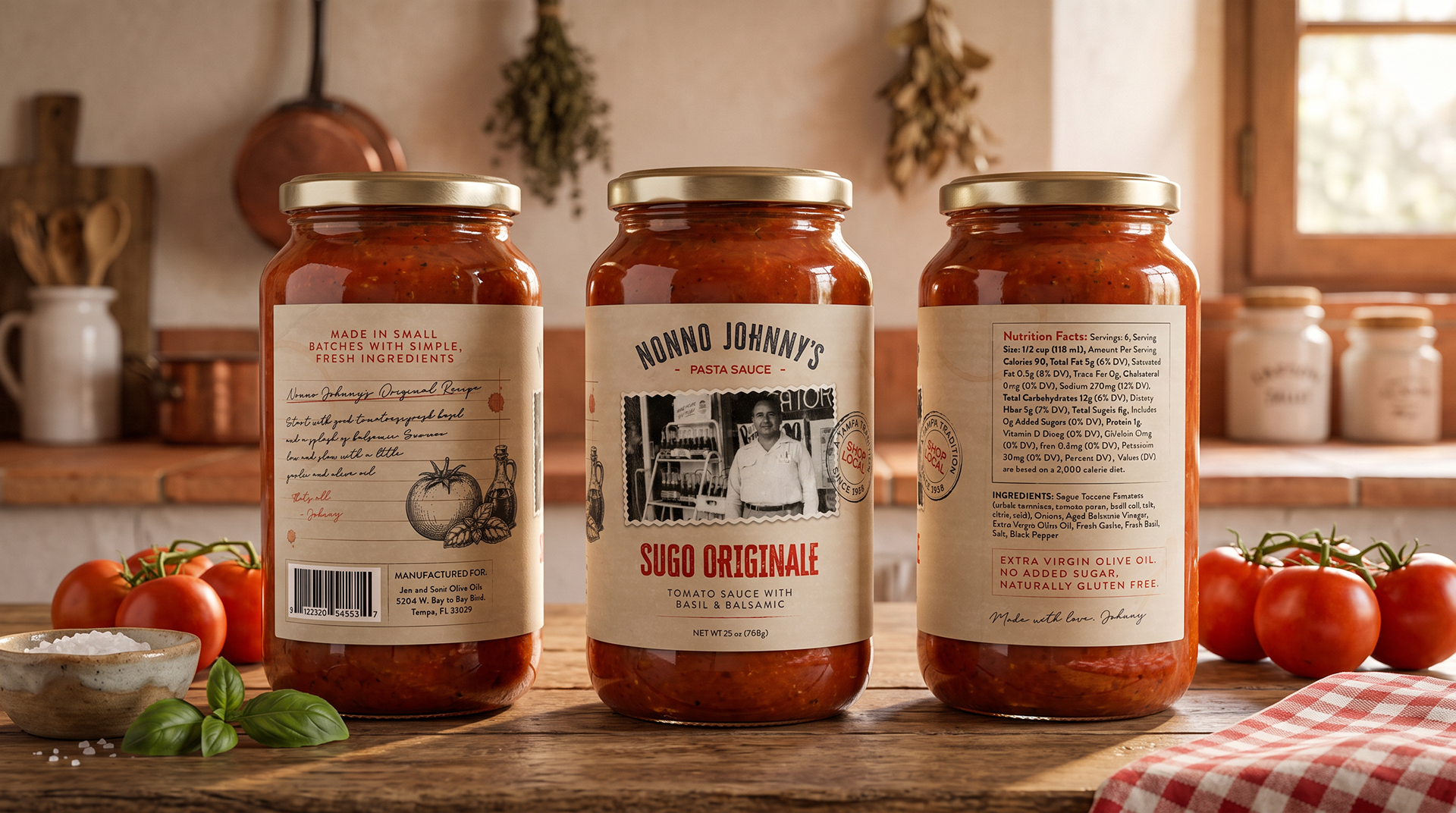
Illustration System
Each sauce features a custom ingredient composition inspired by vintage cookbook illustrations. The illustrated style reinforces the family recipe concept, while distinct accent colors and ingredients give each variety its own recognizable identity.
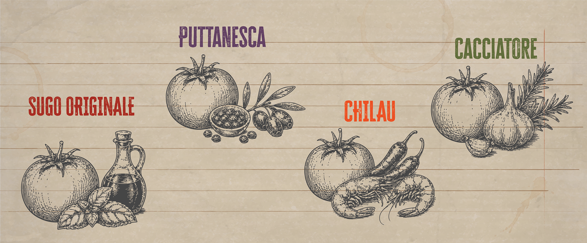
AI-generated ingredient illustrations selected as part of the client-approved creative direction.
Result
The final packaging system gives Nonno Johnny's a distinct identity rooted in family, food and tradition. Each sauce maintains its own personality while remaining immediately recognizable as part of the same collection.